The Claim Climbers logo provides a clear, recognizable expression of our brand. Ensure clear size, space, color, and background considerations are taken when utilizing the logo.
Lockup
The lockup is the primary expression of our logo, meant to be used as the main form of identifying brand communications, partnerships, and messaging. There are distinct versions for use on light and dark backgrounds; please take care to use the appropriate version when applying the lockup.

Icon
The Claim Climbers Shield reinforces brand identity when the brand has already been established. It allows more creative freedom in brand expression and design. Using the mark on its own is allowed in situations like the interior pages of printed communication or on a website under an office Claim Climbers domain.

Wordmark
The Claim Climbers wordmark should be used sparingly, and only on media and communications that incorporate the brand shield as well.

Basic Usage
- Choose your logo based on the background color/texture and potential application. or example, logos used over images may need to be monochrome in order to maintain proper contrast, or logos that are to be embroidered may need to be monochrome due to production requirements.
- The logo is designed to have defined light and dark areas. Ensure that the stars, sky, and the "snow" of the mountain appear lighter than the background. This is a good guide to use when choosing which version of the logo to use.
Clear Space
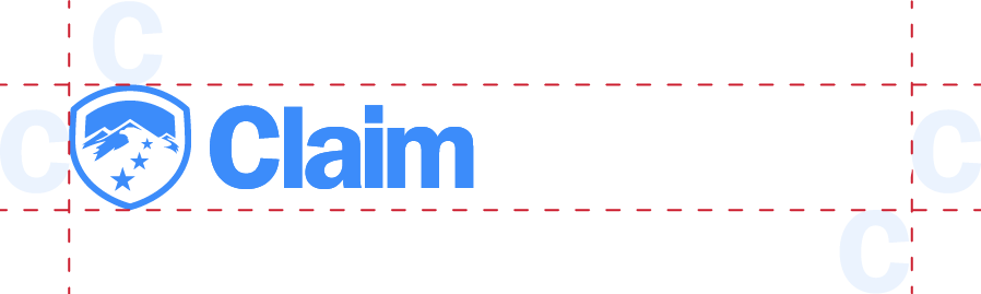
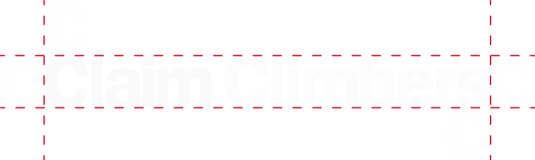
To ensure the logo is not crowded and is easy to recognize, it is important to maintain ample clear space around the logo. Our clear space definitions are self-referential, allowing the designer to create clear space using the logo version at hand. Remember that clear space is a minimum, and more can often create an even stronger visual impression
Lockup
Clear space around the lockup is defined by the letter "C" in Claim Climbers. Measurements are taken from the edges of the shield on the top, left, and bottom, and from the edge of the "S" in "Climbers" on the right.
Icon
Clear space around the icon is defined by using the height and width of the largest star from the shield.

Wordmark
Clear space around the wordmark is defined by the capital "C" in Claim Climbers.
Size
The logo is designed to be flexible and can be used in a variety of sizes. However, there are sizing minimums that should be maintained to ensure legibility across platforms.
Lockup
The minimum width the lockup should be displayed at is 125px or 0.5 inches.
Icon
The minimum width the lockup should be displayed at is 16px or 0.375 inches.
Wordmark
The minimum width the lockup should be displayed at is 100px or 0.5 inches.
Do's and Don'ts
Visual examples pendingDo's
- Ensure clear contrast from the background the logo is place on
Dont's
- Don't distort, stretch, or modify the logo's dimensions
- Don't change the colors outside the approved versions
- Don't cover faces or key information with the logo
Partnerships
Care should be taken to ensure partner logos are given equal weighting and space to ensure balance in any lockups and compositions.